DNR Group

All - Identity - Print - Web
The Client
DNR Group offers high-quality printing and mailing solutions to
help deliver higher returns. They specialize in the production of
direct mail packages for a variety of markets, including the
non-profit, fundraising, telecommunications, auto and financial
industries. From concept to completion, they provide the tools and
the talent to produce products on time and within
budget.
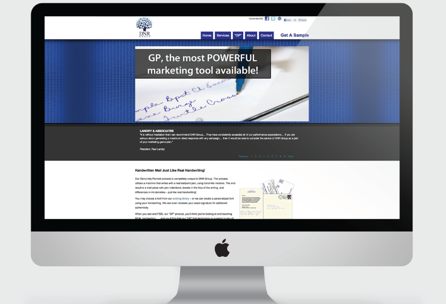
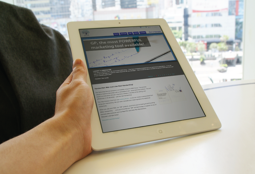
Their Genuinely Penned process is completely unique to DNR
Group. The process utilises a machine that writes with a real
ballpoint pen, using hand-like motions. The end result is a mail
piece with pen indentions, breaks in the flow of the writing, and
differences in ink densities – just like real
handwriting!

The Project
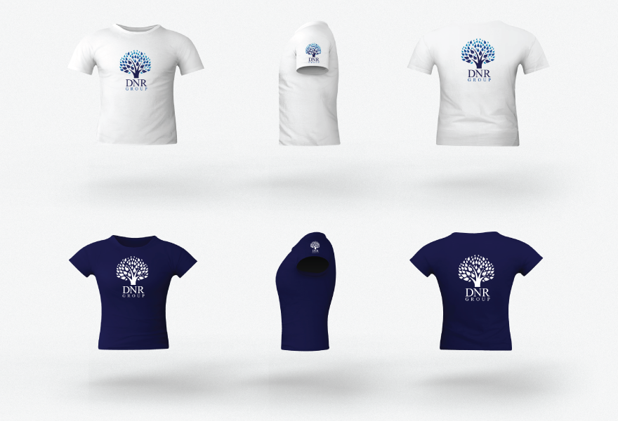
I was approached and asked to design a new logo identity for the DNR Group by one of their Sales Executives who had notice my work on a stock site.
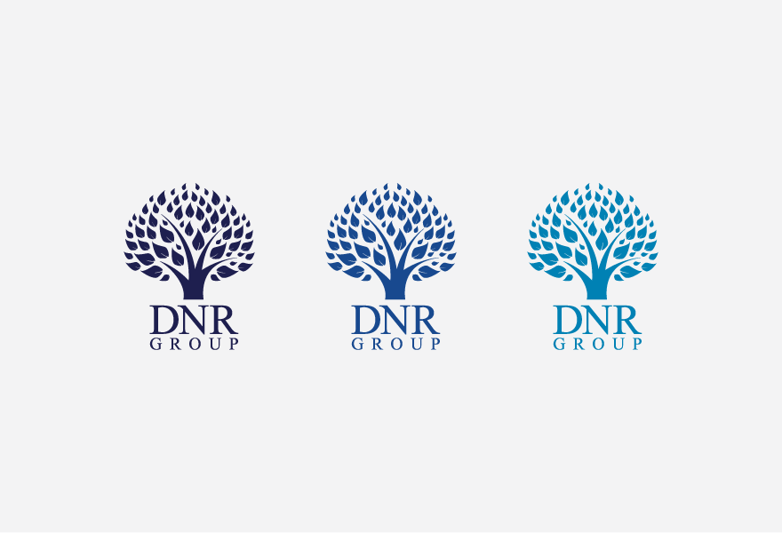
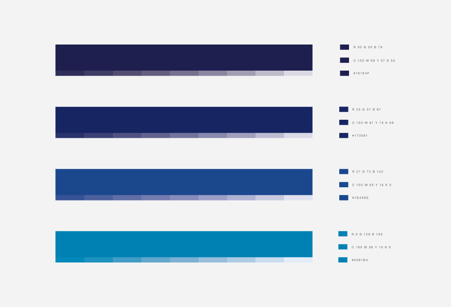
The basic outline and idea was put forward by the client and specifically required a tree like logo to signify growth. After originally putting forward a green colour palette, the client requested a change to blue.
The Result
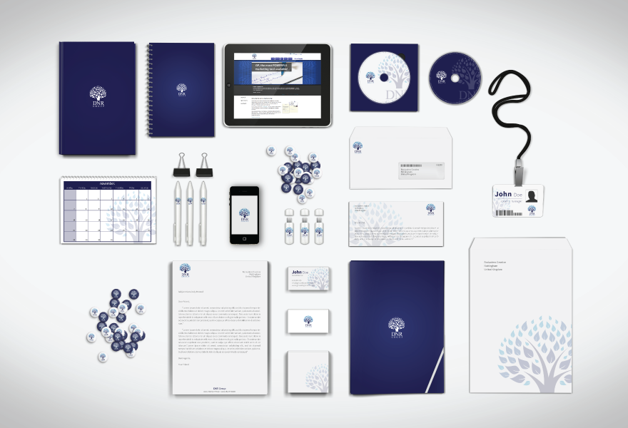
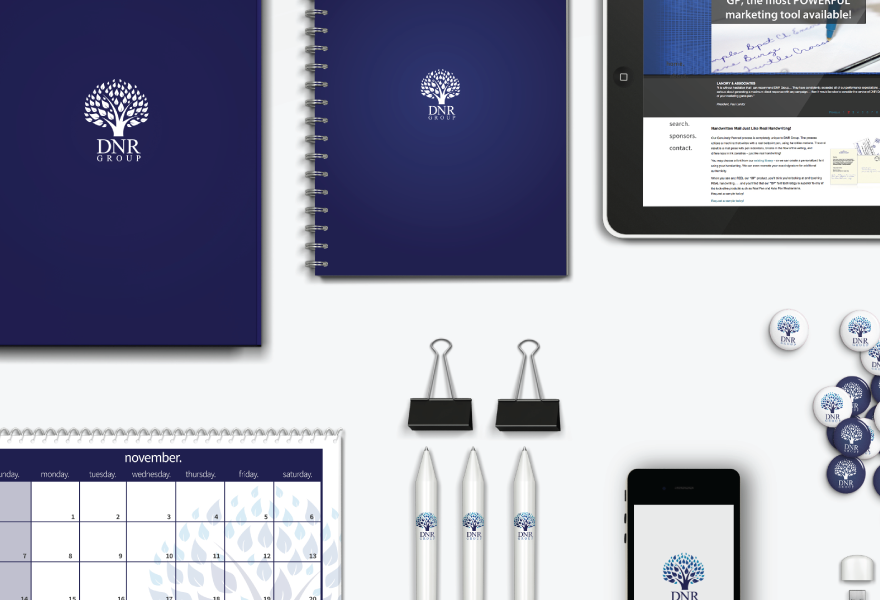
A clean, fresh and modern logo solution.
The typeface chosen is a professional serif font to promote the business side of of a creative, forward thinking, growing company.
Date
May 2012
Location
USA

© Copyright 2012 Rockadero Creative - Website Design / Hosting
Base - Blog - Sitemap


